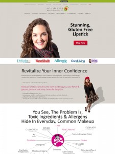
Every now and then I come across a website that makes me stop and take notice. It has the “wow!” factor. Now, I want to stress, for me the wow factor is not cool design or creative effects. What really makes me sit up and take notice is when a website is designed to engage the reader, draws them in and offers clear benefits.
Red Apple Lipstick is such a site. It’s owned by member of an Internet marketing mastermind group I belong to, and this guy is certainly ambitious and switched on when it comes to marketing his products online.
Simplicity Sells
What I like particularly about the Red Apple Lipstick site is its simplicity. A lot of ecommerce websites are too busy. You don’t know where to look first. But with Big Apple Lipstick your eye is drawn immediately to the heading “Stunning Gluten Free Lipstick” and this is complemented by an image of a woman wearing red lipstick i.e. a clear, simple message. If you’re looking for gluten free lipstick, you know you’re in exactly the right place.
In case you need a bit more convincing, move down the page and there’s a heading ‘Revitalize Your Inner Confidence”. Again, clear and simple, stressing one of the benefits of the wearing this lipstick. Another attractive woman to reinforce the message and some simple lines of sales copy to spell out the benefits of buying this lipstick.
Long web page versus short page
This is a long web page. (It goes against the modern trend to keep web pages short because “people won’t read long pages and you shouldn’t make them have to scroll” – what rubbish! If a long page is well written and engaging, the people who are going to buy the product or service will devour it.) The page is nicely broken up into sections, with clear headings, each focusing on a different benefit of the products.
An innovative touch to allay customers’ fears
 Now, this is the kind of creativity that I do admire. As the reader approaches the bottom of the page, the website offers two additional incentives to get them over the line.
1. ‘Never Pay Full Price’ – offering coupons to give discounts to all customers – this is nice marketing touch.
2. ‘Don’t Be Nervous To Order Online’ – I have never seen this before on an ecommerce website – but it makes so much sense. All the most common fears about buying lipstick online are answered one by one. If you’re wavering about whether or not to buy, this is certainly going to help you to take the plunge!
And to finish, there’s some great testimonials, with photos for extra credibility.
Footnote: Big Commerce
Red Apple Lipstick is also a great example of what can be achieved using the Big Commerce platform to build an online store. Big Commerce is my ecommerce platform of choice. I’ve used it for several years after trying most of the main competitors – I keep coming back to Big Commerce.
