The inspiration for this post comes from Wes McDowell from The Deep End so I want to acknowledge this at the outset.
It’s the time of year when loads of predictions are being made about web design trends for 2016 – but in this post I want to look specifically at web design trends that work to increase conversion (i.e. get people to take action on your website by making an enquiry or buying something).
So let’s get started with trend Number 1.
1. Number one on the list is large full width images. Studies have shown that big, bold images at the top of a web page grab people’s attention. And then the secret is to have a short but clear sales message on top of the large image.
Xero’s website is a good example of how to do this.
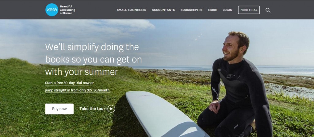
Research shows large images with happy, smiling people in them work best. People like to see other people.
If you want to take this trend even further, a large, full width video at the top of the page can be powerfully effective. The video needs to be subtle though, so it’s not too distracting.
2. Trend number two is split screen layouts. This is really effective when you have more than one product or service, and you can immediate direct your visitors to the part of the website they want.

3. Number three is prioritized navigation. There’s a well proven principle that given too many options, people are likely to choose nothing at all. In fact, studies have shown the more options you give people, they are exponentially less likely to convert – yet it’s hard for us to accept this as business owners when we have so many great offers we want to make.

So, keep your main navigation simple. Just put your most important pages there and then take your main call-to-action and make it into a button.
When you do this, you’re telling people clearly where you want them to go.
Other design trends
There are several other designs trends that are likely to come into their own in 2016, which are not in my top three. It’s worth noting one of them, which is the use of Pinterest-style “cards” to highlight different sections of a website.

A final word
Cutting edge web design is important but it’s not enough to create a truly effective website. Above all, you still need a clear sales message, a clear point of difference for your business and the ability to communicate this clearly in words. Design is just the icing on the cake.